Convergence Parallam Table- Taller
I had a commission to build a custom height version of my Convergence table. I have had a great response to my original post on building a Parallam Table, so I figured this would be another fun one to document.
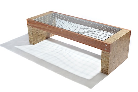
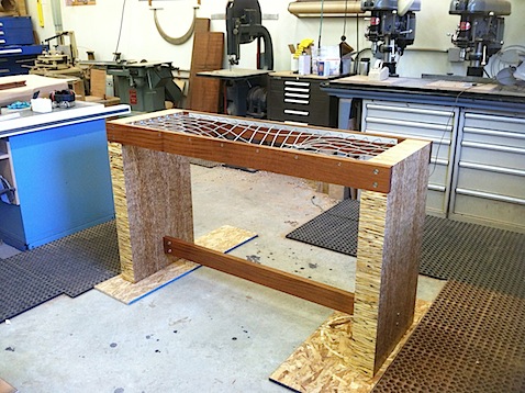
Here is a picture of Convergence, my Parallam coffee table. Those legs are actually four pieces of Parallam glued together. This custom table is substantially taller and needs even more blocks to make each leg
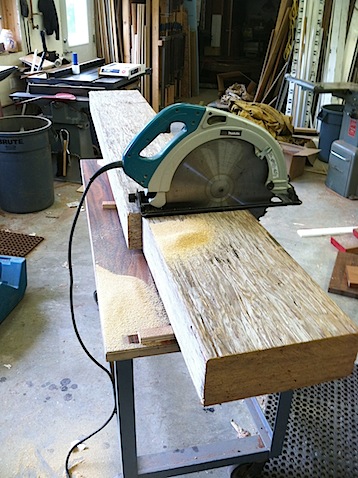
The first step is cutting down the massive timbers of Parallam to more manageable pieces. I recently bought a 16″ Makita circular saw to assist with this task and it is an amazing tool, albeit a scary one to run!
This creates a beautiful pile of pieces of parallam
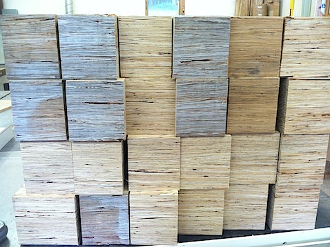
They stack up to begin to reveal the beautiful endgrain. The stripes are from making two passes on a table saw in order to get through its 5″ thickness. These will be sanded out later.
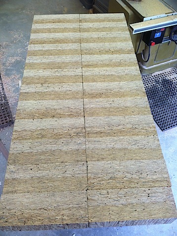
Time for some glue
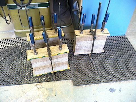
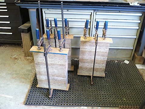
The stacks begin to grow.
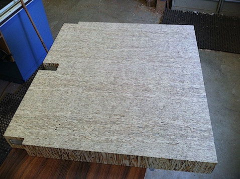
Once constructed, they are sent through my wide belt sander. This evens out the roughness from the sawing process and makes the faces look like one board.
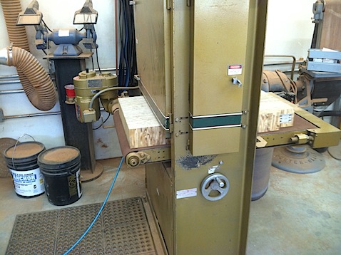
After sanding!
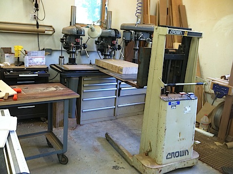
Here I use a little alternative thinking to support these massive legs while drilling holes with my gang drillpress.
The cables are completely random when they are first put into place.
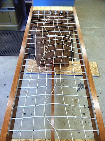
Once stretched, they form a beautiful basket reminiscent of Einstein’s theory of gravity!
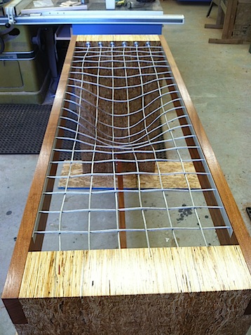
The completed table, ready for a glass top
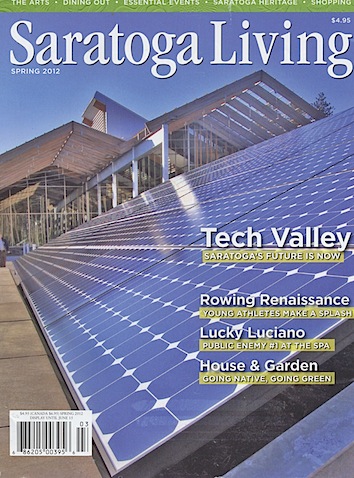
Saratoga Living Features My Furniture and Studio
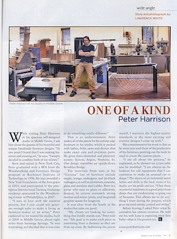
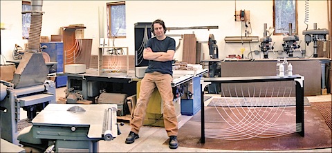
My studio is 15 minutes outside of the great upstate NY town of Saratoga Springs. One of the local publications, Saratoga Living, did a nice piece on me and my studio in the Spring 2012 issue. Lawrence White came out to the studio and took a cool shot that shows me in the studio with a number of machines and my Divergence Table. Also hiding in the shot are a pair of Torus Pedestals.
Lawrence also wrote the text giving a nice glimpse of my life and building my modern furniture.
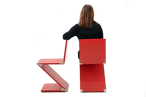
Redux Chair in Interior Design Magazine
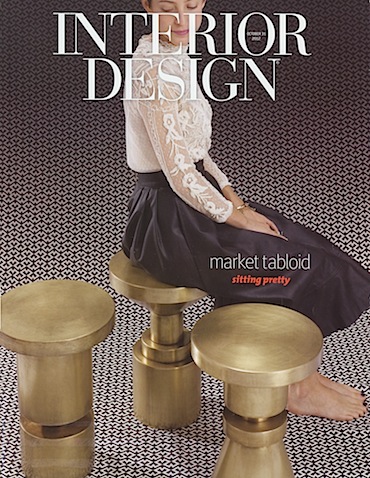
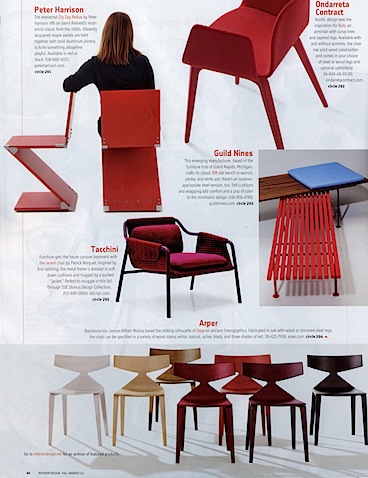
My Redux Chair had an amazing spot in Interior Design Magazines Fall Market Tabloid. The chair sits on the upper left of page 40 and gets a nice little write up.
I have been thrilled at the response to these chairs. They continue to impress viewers with their alternative joinery and bold red color.
From the article “Harrison Riffs on Gerrit Rietveld’s modernist classic” So cool!
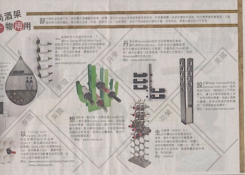
Barossa Wine Rack in the Hong Kong Financial Times
My Barossa WIne Rack was featured in the October 25, 2012 issue of the Hong Kong Financial Times. I am not sure what it says but love the placement. The article is a feature on interesting modern wine racks and storage.

